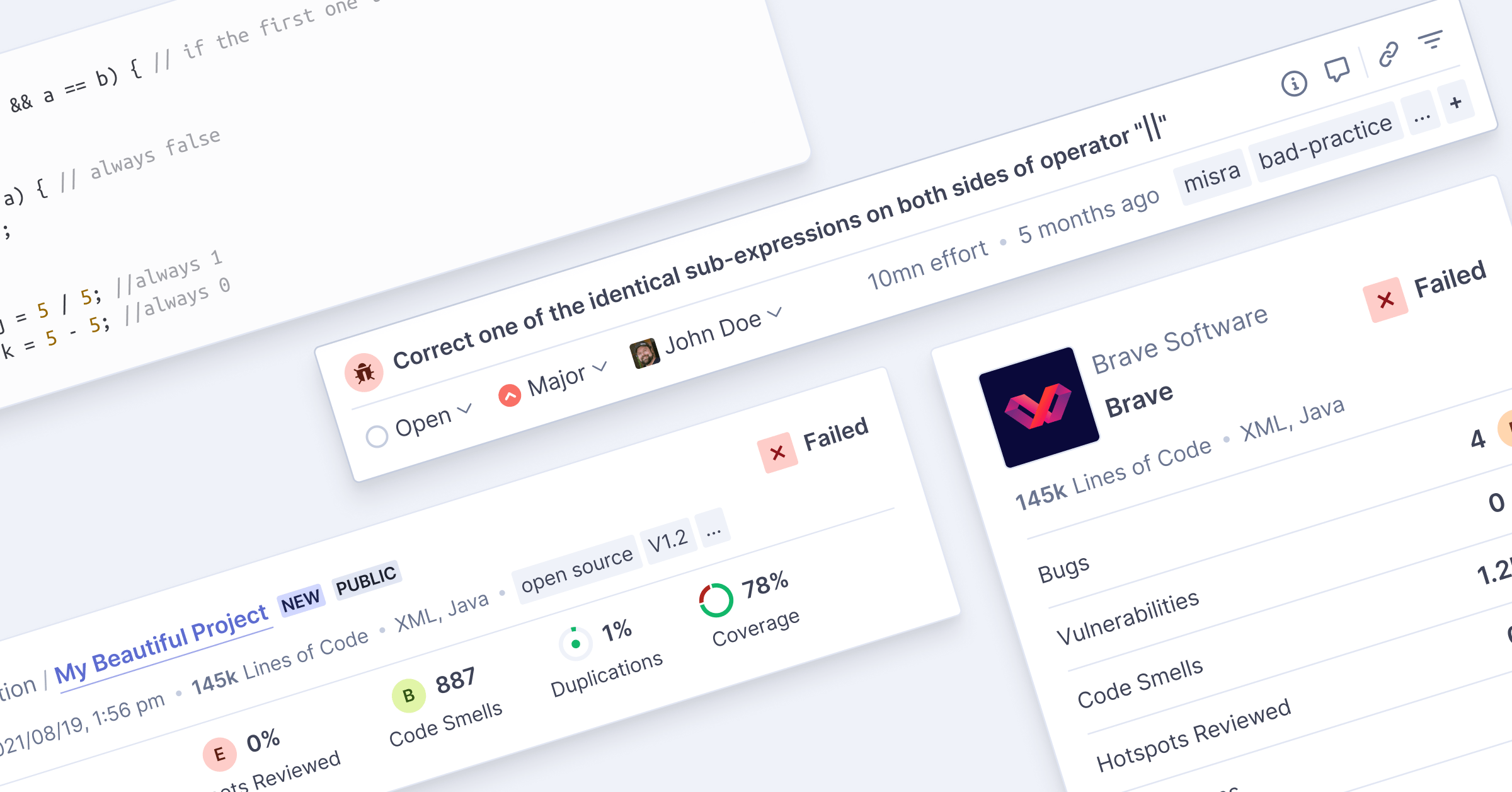
We just released the first of a number of updates to the SonarCloud user interface. It’s a big step toward a more modern, consistent, and accessible UI.
We tell you everything there is to know about this release in this blog. We invite you to read it and give a try to the new SonarCloud UI! We hope the UI improvements will make your experience in the product even better.
Did you find usability issues? Open a dedicated thread here.
We actually started working on it. We’d like the design and user interface of SonarQube to benefit from the effort that was done on SonarCloud to get a more modern and consistent UI. It doesn’t mean that you’ll get the same UI on SonarQube, but you should discover step by step a more modern user interface in the next SonarQube versions.