Hi, I want to create a bubble chart to compare my custom metrics, but I don’t know where to start. What do you advise me?
Hi,
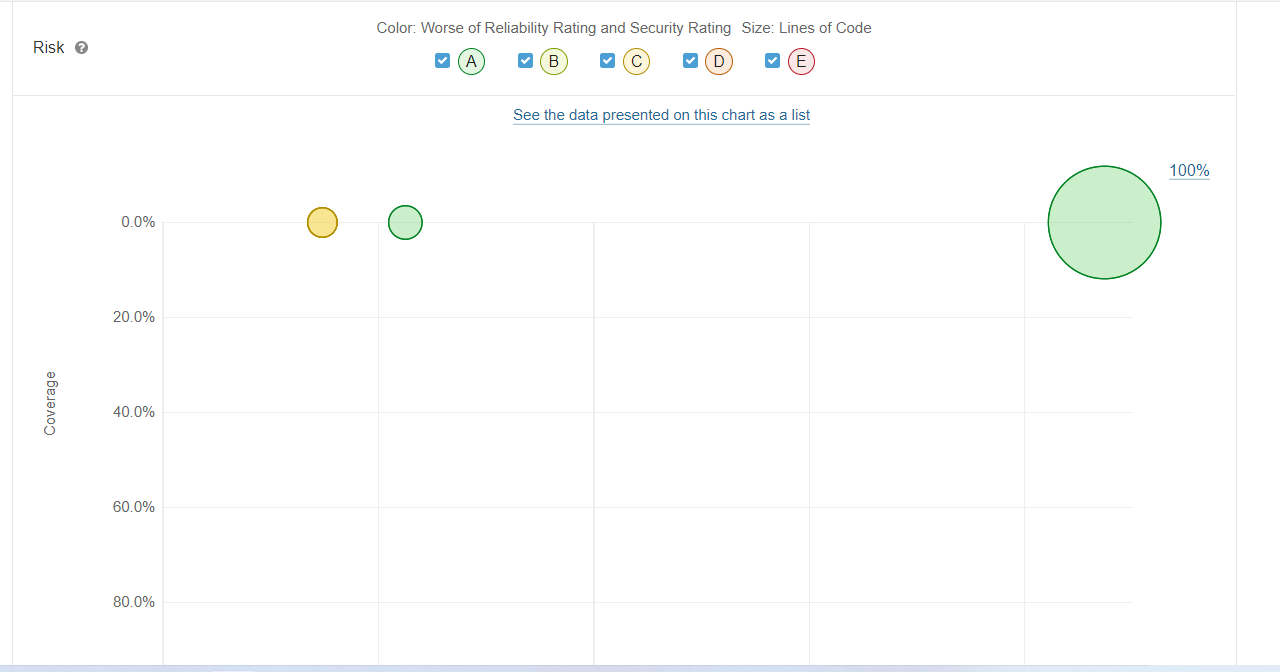
I don’t believe you’re going to be able to create this for your custom metric. That chart shows up on the Overview for the metric category. That’s something hard-coded in the UI & not just automatically generated per category.
![]()
Ann